How’s That Working Out for Ya?


How’s That Working Out for Ya?
[Special to the Perspective] — I had to rent a car over the weekend. I chose the $9.99 special, a Hyundai Sonata. It was not awful; I would get it again for just the Sirius Radio.
This was my first experience with Korean cars and I didn’t find the cultural cross over difficult at all — until I encountered the Cat Folder button.
Better yet, in what shape would my car fold a Cat? Should it be a neat little bundle, an origami form?
Is it a tri fold? Do we leave the head and legs out?
Having folded a Cat, in my car, what am I to do with it? (well aware of Korean cuisine I pondered many possibilities).
Finally, how does the Cat feel about all this? Not too happy, I expect.
Fortunately, I’m very allergic and can’t have a cat so somewhere in the Northeast United States there is a lucky, unfolded Cat, that I don’t own and therefore will never attempt to fold.
–Caitlin Abbate
I hate to reinvent the wheel.
(As an aside, that probably explains why I don’t like to drive the same road back that I take to the store, but that’s a whole ‘nother kettle of fish.)
 Liz Arden and I were discussing using off-the-shelf widgets in product design. We mostly do that all the time. A conveyor builder, for example, would no more design a proprietary chain or sprocket for the electric motor than build a fiberglass cow to straddle the conveyor belt in a book factory. See, someone else has already invented the roller chain and you can buy as much as you want at any industrial hardware store.
This story is about websites.
I mentioned this preference for off-the-shelf stuff because I’ve been jinkering with the North Puffin Gallery. That’s my site over here that acts as a portal to my mom’s paintings and scratchboards, my own portfolio of interesting work that may be for exhibit only, and the emporium where I try to separate art afficionados from their moolah.
Lazy I am. I like slideshow gallery presentations but I hadn’t bothered changing from my static display, mostly because I really didn’t feel like reinventing the wheel. Or writing the code.
There are 29,763 freely downloadable slideshows available online.
Lazy I am. I like slideshow gallery presentations but I hadn’t bothered changing from my static display, mostly because I really didn’t feel like wading through all that code.
OK, I started wading.
First things first. The design parameters.
Any slideshow must “fit” the other pages on the site.
The “slides” had to be easy to update as the exhibit changes.
Slides should link to descriptive (or sales) pages.
The show should have navigation buttons.
The page cannot use Flash™.
The code had to be open source and easy to change.
The original source code of “open source software” is freely available and the owner allows all users to use, redistribute, and modify it.
Flash™ is common on sites but (fortunately) many designers are moving away from it in applications like this. It is sloooooooooooooow loading. The back buttons are difficult (or impossible) to make work. Basic text functions like copy-and-paste don’t work. Adobe doesn’t even use it on their own site. And it doesn’t scale well to mobile devices. I decided right from the start to use standard HTML and Java coding.
I found a bunch that fit my list.
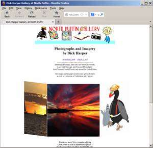
 This is Ger Versluis’ Carousel, a page that has that displays multiple images in a 3D, carousel style. It has a number of lovely tricks for code that was written a decade ago. The slides slide in from either right to left, or left to right. I can set it to have pretty much as many images in view as I want (I chose three for this sample). Each image can have its own associated link. The carousel pauses on mouseover. And the script works in all browsers introduced since about 2001. Cool.
But it doesn’t have a way to title the images and there are no navigation buttons.
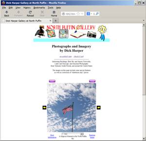
 Patrick Fitzgerald developed this script about the same time Mr. Versluis released the carousel. It doesn’t have the multiple images sliding around that we see on other pages but I made my own custom Start and Pause buttons, and moved the other links to match my page layout. The best part for me is the dropbox that lets you go to any slide in the show and then restart the flow from there.
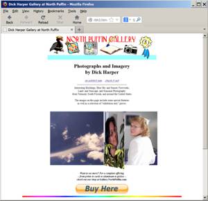
 Book Flip is another image slideshow from Mr. Versluis. This time he simulates a page being turned to reveal two new slides at once. It is indeed an impressive display. I set it to flip horizontally because our browsers and monitors mostly display in landscape but it can work vertically. Each image can have its own associated link. The carousel pauses on mouseover. And the script works in all browsers introduced since about 2001. Cool.
But it still doesn’t have a way to title the images and there are no navigation buttons.
I like the carousel in number 1 and the book feel of number three but I love the controls and added text in number two.
Blog Contest:
OK, OK, it’s really a survey. I really want to know which of the three slide shows you like better. Click one of these links to drop me a quick email to let me know or leave a comment below.Sample #1 Sample #2 Sample #3 A winner (chosen from among all the entries) will receive a free lifetime subscription to the No Puffin Perspective™1!
Something Else
And if you want to look at the code to tell me how to add the buttons to Number 1 or Number 3, that’d be great!
Next up, why the remote control for your TV doesn’t speak to your BluRay player.
1“Lifetime” in this case means the life of the world, the Internet, or this online column, whichever ends first.