Right? Right?
Except Carroll Wright’s entire quote is “Figures do not lie but liars figure.” Carroll D. Wright was United States Commissioner of Labor, addressing Congress at the time; he probably drew on earlier but unattributed versions of the saying.
In the story, Stagnant Wages Imperil Financial Security, the PBS Newshour and Bloomberg News collaborate to paint a deliberate picture of pernicious inflation eating away at our income (true) and that we need to increase the minimum wage to combat it (not true). See, there may be plenty of reasons to increase wages as well as plenty of reasons not to. This story doesn’t tell any of them.
“I would go to neither outlet for facts,” Rufus said when he sent me the original link, “but this is all the way over the top propaganda (or monumentally stupid.)”
 At the core of the story is this animated graphic that they say shows wages aren’t keeping up with prices.
Figures don’t lie but liars do figure.
I had trusted Bloomberg News. Co-founded by former-NYC Mayor Michael Bloomberg and Matthew Winkler, it delivers what we thought was accurate financial news to subscribers. Mr. Winkler was a writer for the Wall Street Journal. Pretty good creds for a finance reporter. They wanted to undercut the competing Dow Jones News Services.
That’s why it disturbs me that Bloomberg’s Roben Farzad would use data he has to know he manipulated to illustrate the PBS story. See, the problem with Mr. Farzad’s chart is that he adjusted the wages data for inflation and then compared the result to inflation. Apples versus oranges. Lies versus truth.
PBS corrected itself. Sort of. “A few of you who visited the NewsHour website last night commented on a graphic we created for yesterday’s show. It was meant to explain the relationship between stagnating wages and inflation. What we should have said is that one reason wages adjusted for inflation have been so flat for so long is that rising consumer prices are eating up a good deal of the gains.” They even offered a chance to view a “selection” of those responses and a corrected graphic but there was no link to the corrected graphic and the main body of the story still uses the wrong one.
Figures don’t lie but liars do figure.
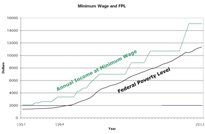
Here’s the chart they should have used:

Huh. Here we can see that published figures of minimum wage income for one person and the annual federal poverty levels for a family or household of one tell the opposite story. Minimum wage income has grown slightly above the alleged market prices in the Federal Poverty Level. The unadjusted data from each year doesn’t lie.
Unfortunately, the real data doesn’t tell the story PBS and Mr. Farzad wanted to tell, does it?
We’re left with two conclusions. Either (a) PBS and Mr. Farzad are too stupid or too uneducated to do simple arithmetic or (b) PBS and Mr. Farzad lied to us to push an agenda. This is very, very bad. The first indicts our schools since every editor and reporter has been graduated from somewhere. The latter indicts the media.
Bottom line? Rufus was right.

Mike Gay quickly threw a graph together for comparison. It shows actual wages v. actual CPI. I don’t know his data source, but the slopes are quite similar to the published figures of minimum wage income and the annual federal poverty levels shown above. PBS and Mr. Farzad could have used this graph, too. They didn’t.
ALWAYS pleased to be right…..
;-)