Professionally, officially, I’ve never had much reason to consider how humans interact with the machinery I’ve designed. In fact, since my specialty is material handling equipment, I’ve had lots of reason to consider how to keep humans from interacting with the machinery I’ve designed. Belts and gears and pushers and pullers and blades and fingers should be kept mutually exclusive.
All that changed when I designed a boat.
 I like how stuff feels in my hand, whether a boat hull or a nice shirt or a cordless phone.
Apple’s former “Human Interface Evangelist,” Tog Tognazzini, told Science Friday that Apple doesn’t deserve its reputation for good design anymore. (Be warned that SciFri’s SoundCloud will make you sign in just to listen to the file.)
Apple has a well earned reputation for perfect, intuitive gadgets.
Back in the old days of the 80s, manufacturers printed a long book (translated through Sanskrit from the original Chinese) of instructions and illustrations for most anything you bought. Tech writers ruled. You’d either “RTM” or spend the rest of the machine’s potentially very short life fiddling with it to learn how to use it. We techies bemoaned the day manufacturers stopped supplying that long, printed manual.
Apple fixed that.
Steve Jobs changed your life and mine.
“iOS raises the bar for excellence in user interface design and offers great opportunities for you to deliver engaging and unique user experiences. Consider these common design concepts before you start coding to enhance the usability and appeal of your apps.”
Apple made it not just possible but necessary that anything you hold in your hand be hand friendly. Or not.
Wikipedia tells us, “The goal of this interaction is to allow effective operation and control of the machine from the human end, whilst the machine simultaneously feeds back information that aids the operators’ decision making process. Examples of this broad concept of user interfaces include the interactive aspects of computer operating systems, hand tools, heavy machinery operator controls, and process controls. The design considerations applicable when creating user interfaces are related to or involve such disciplines as ergonomics and psychology.”
The industrial design field of human-machine interaction also has concepts that work across interpersonal relationships as well.
My friend gekko held forth on the latest modern management style: “The latest flavor of The End All Solution To Managing Employees and Co-Workers fades quickly and no others rise to replace it,” she wrote over here.
Exactly. Most of these management fads are pretty much designed by aliens who have never actually probed a human. The closer in me would like it if the “Human Resources” folks inventing this stuff had at least rotated through an actual Human Interface design department. And taken the flack that should come when they get it wrong.
Hey H.R.? There are more people doing the work than in your “sample.”
H.R. gets it wrong more often than not because they forget to test their latest fad on real employees.
Mr. Tognazzini makes the point that Apple did that, too, with their new, gray, “flat” iconography and text interface. If you’re over 50, you can’t see their new, gray, “flat” iconography and text interface.
 Hey Apple? There are more people over 50 than under 25 in your test market!
Apple gets it wrong more often than not because they forget to test the design on their actual users.
I’ve written before about the Panasonic cordless phones I like so much. The phones have always fit my hand and my pocket nicely. They have a headphone jack and work excellently with my headset. They have plenty of memory in the phonebook and multiple ringtones that can be assigned to various numbers. They have built in call blocking.
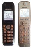
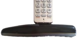
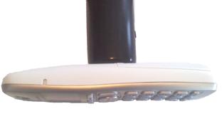
I had to buy a new one. You can see the old black one and the new white ones in these photos.
 Sadly, Panasonic changed the cordless phone face. Just a little bit. “We’ll make the buttons bigger so our older users have a better experience!”
Except the bigger buttons now let you butt dial or table dial or hang up the phone when every you use it. The bigger buttons ride up on the sleek, curved, front face and stick out farther than the body. I saw that the first time the phone butt dialed my neighbor. You’d think the Panasonic design department would have noticed.
Panasonic got it wrong because they forgot to test the design in the real world.
There’s a moral in there.

Wot’s a “cordless phone”? Did you mean a cellphone or smartphone?
What are “buttons”? I mean, other than those things you use to close up your shirt or pants.
I’ll have you know I have never had to button my fly.